It started with a one-minute video on Instagram. Mizzian, who teaches Muay Thai in Tegueste, telling where he came from. I watched it and thought: I’m making this gym’s website.
What I didn’t know was everything that came after. A first version that turned out ugly, an iPhone that refused to play a film, and an address that isn’t on any map. Let’s take it step by step.
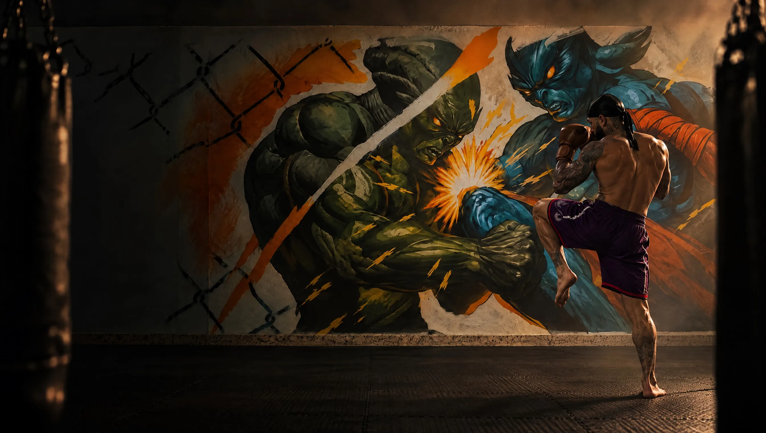
Un mundo aparte.
Muay Thai, Brazilian jiu-jitsu and capoeira under one roof.
A world apart
In the video he talks about Las Cruces, in Garachico, about rap, about Muay Thai, about leaving home at 17 and about bad decisions. And in the middle of it he drops this: “Sport has always helped me get out of the darkness”. That was it, he had me.
In another video he explains why it’s called Alien Thai. He wanted a place where you forget about this planet’s problems, a world apart (“un mundo aparte”). That line went straight to the home page. And his story… his story was the section that gave me the most trouble, but that comes later.
The good news was that almost everything was already in the gym. It just needed putting in order.
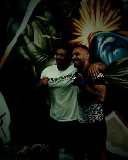
Mural, name, story. I had everything… except one thing. And it took me a while to realise how much it mattered.
From boards to sketch
Creativity didn’t fall from the sky. It was more like training: look a lot, try things, throw almost everything away and repeat what worked.
I started looking at all kinds of websites. Combat sports, gear brands, design studios, and even things that have nothing to do with hitting people. I grouped them by section, several ways of doing the same thing side by side.
Each board helped me think through one specific thing, how do I show the prices, how do I tell a story, and my own version came out of that, sometimes mixing two ideas. Everything in grey first, piece by piece. Colour, at the end.
3 options
A menu that stays out of the wayHere the image is in charge. Hidden menu, logo in the middle and a single button: the trial class.
3 options
The first screenI kept two ideas at once: a big disc behind the fighter, which ended up being the sun in the mural, and the thing that always works, photo, headline and two buttons.
3 options
Three arts, three photosIcons, cards with text or photos of people training. The photos won, no question.
3 options
Prices you read at a glanceBig numbers, one highlighted plan and that’s it. Nothing to think about.
3 options
Telling where he comes fromNo timeline. Chapters, and at the end his line full screen, letting him speak.
3 options
An ending with its own nameThe map to get there and below it the name, huge, edge to edge.
Last step
And then, colourWith everything in place, it was time to paint. And the colours were already in the gym: the tatami, the wall and the green of the aliens. Press the button to see it in grey or painted.
The first version
In grey everything fit. Then I made the first real version, with a red disc and a button to try red or green. And it turned out ugly, no point lying.
You can browse it right here or open it in a new tab.
There it is, open the menu and try the colours. Green won, but even so. It didn’t look like the gym. And that’s when it hit me: I had no images of my own. I had loose Instagram videos, every one of them different from the last.
So the question changed. It was no longer which photo do I use, it was how Alien Thai should look. The masters in black and white, against a studio background. The aliens from the mural coming out of the wall, in 3D, for the prices. Even the numbers in the story with the same texture as the aliens, so nothing would look like it came from another site.
Three arts,
one world.
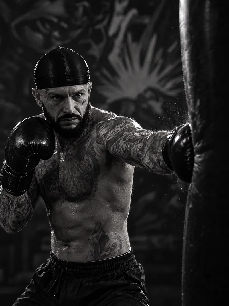
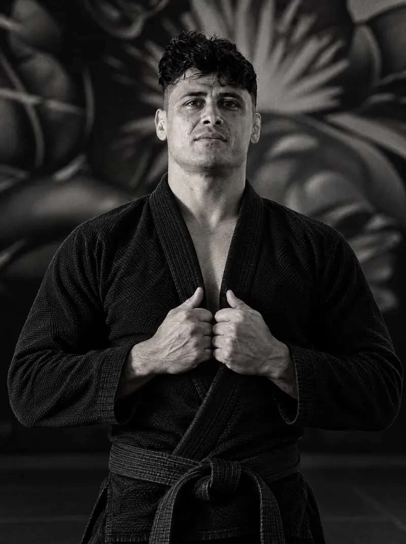
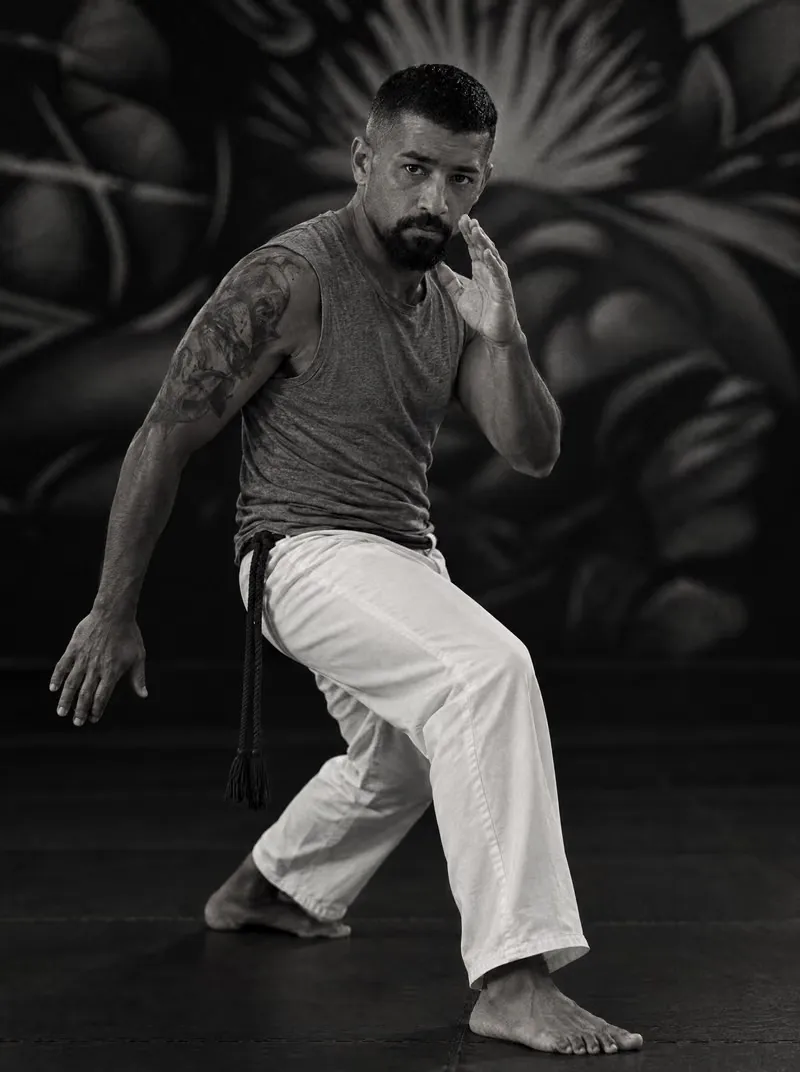
Wall, tatami and green
With that settled, the colour came on its own. There was nothing to invent, only to look: the greenish black of the tatami, the off-white of the wall and the green of the aliens. Tap a colour and see how the site changes.
Pick your round
The prices could have been a table and done. But no. Three cards, big numbers, the good plan in green and an alien moving in each one.
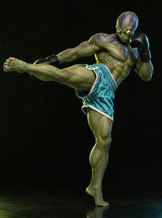
The kick,
at your pace.
Getting out of the darkness
And we reach the section that started all of this. Mizzian’s story in four chapters, with a film that moves forward as you scroll: Garachico, his face, the bag in front of the mural and the other side of the gym.
On the computer, perfect. On the iPhone, frozen on the first frame. Right in the part I cared about most. In the end it was one line of code, just one. Finding it was another story.
I don’t regret anything that has happened, because I’ve learned from all those bad decisions.
Camino Viejo 56
All that was left was the easy part, putting the gym on the map. Not quite. Number 56 isn’t on any map, and the one I had in my head, dark like the site, didn’t exist. So I made it myself. It’s the one you see at the end.
More than twenty versions after that first ugly one, here it is. Go in and have a look around.
You can browse it right here or open it in a new tab.